


Sheaffer "Dolphin" Pens 1962-1964
by Jim Mamoulides, November 22, 2003, Updated July 23, 2004

Another Oddball "Imperial"?
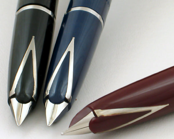
Sheaffer 500 "Dolphin" Pens - Detail Showing Characteristic Section And Nib
If you focus your collecting on Sheaffer Imperial pens you are eventually going to run across several pens that look like Imperials, but are decidedly different. To novice collectors, it's sometimes hard enough to understand the differences between a vintage Imperial and a PFM.
"What about that sharply tapered 'Imperial' with the funny, straight nib? Isn't that an Imperial?"
Well, no. That one is called a Stylist.
"What about that really short 'Imperial' with the cool windows in the side?"
Well, that's actually a "compact cartridge pen" called a Comp I or Comp II.
"Ok, well those two are different enough where I can tell them apart from 'real' Imperials, but what about this one? What's it called?"
Handed to you is a capped pen that looks just like an Imperial. It's all black plastic, with a brushed stainless cap. It's certainly the Imperial size and shape. The clip is stamped "SHEAFFER'S" and there is no White Dot. It's probably an Imperial II.
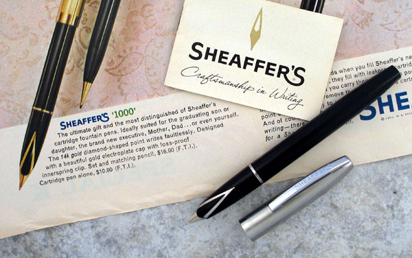
Sheaffer 500 Black Pen c1962-1964
Pulling off the cap, you expect to see a short Triumph nib, but instead you see what looks like an odd variation on the Inlaid nib. It looks like it might be stainless or palladium-silver, but is not marked. Looking closer, you see that the section is quite blunt and the nib looks installed straight into the end, rather that inlaid on top. Close up, the inlaid part is actually just a decoration, a "V" inlaid into the section that gives the short, exposed nib the appearance of the Inlaid nib.
Someone says, "Wait! I've got one of those, too!" A pen very similar to an Imperial IV appears. This one is all black plastic and all gold-filled trim. It's the same size and shape as any other Imperial IV you've looked at, except for the clip, which is also stamped "SHEAFFER'S". The cap comes off, and there it is again, this time in gold, the same funny pseudo-inlaid nib.
What is this thing?
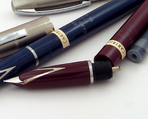
A Set Of Sheaffer 500 Cartridge Pens c1962-1964 - Note Chalk Marks And Stickers On Barrels
"Oh! That's one of those 'Dolphin' Imperials," another speaks up. "I saw one of those at the DC show. I'm pretty sure the dealer called it that. Or was it called a 'Porpoise'? Now I can't remember exactly."
So you look at this oddity and ask yourself, "Dolphin"? Is that a Sheaffer model?
More Detective Work
This pen was very hard to pin down. I remembered only seeing one actual advertisement for it, and that was a small and blurry one on eBay some time ago. I usually copy interesting advertisements from eBay if I can't manage to buy them and use them for future reference. I have a whole disk full of them. I knew the pen would be early 1960s because of the design and the use of the "SHEAFFER'S" logo, which was phased out in 1964, so I could use that to narrow the search. Nothing. No catalog reference. Not a single advertisement.
I put the search away for a while and went after other prey.
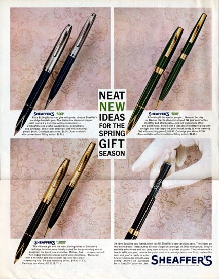
1962 Sheaffer's Advertisement Featuring The 500 / 800 / 1000 Models
Recently, a 1962 advertisement specifically for this "Dolphin" pen showed up for sale on eBay. It showed three different models. I clicked "Buy It Now" and waited for a cardboard mailing tube to appear in the mailbox. I also remembered that Daniel Kirchheimer told me he had a copy of the 1963 Sheaffer Catalog. This would give me two references!
A huge file containing scans arrived in my inbox. The advertisement and the scans arrived on the same day. Paydirt!
First of all, nowhere in either reference are any sea creatures mentioned. Sheaffer certainly referred to Imperials by that name in 1962, and pens that look just like Imperials are called "Lifetime" pens in the 1963 catalog and in several 1963 and 1964 Sheaffer advertisement references I have. These pens are simply called 500, 800, and 1000 both before and after the introduction of the Lifetime models in 1963.
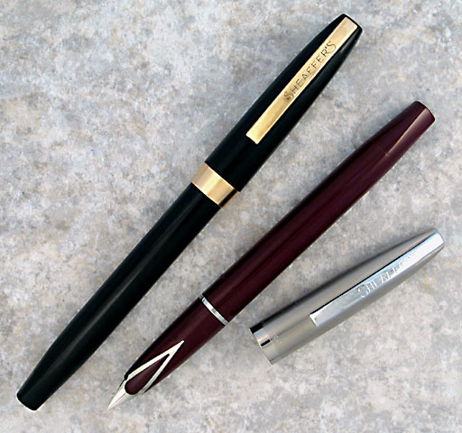
Sheaffer 800 Black (Left) And 500 Burgundy (Right) c1962-1964
As far as production dating goes, I was able to get a copy of the March-April 1962 Sheaffer's Review, the internal company publication, to help settle the starting point. The article, "Marketing Review... Emphasis On Cartridge Pens, 'Reminder' Ballpoints In Spring Programs," describes the rollout of the 500, 800, and 1000 cartridge models, with the 500 and 800 being offered also as Touchdown fillers. The new line was fitted with an "exclusive diamond-shaped" point, which provides "strength and flexibility."
Sheaffer introduced the line to compete in the fast growing US $5.00 to $10.00 market, a market that Sheaffer believed composed "30 percent of the $41 million fountain pen market." Cartridge pens had rapidly grown in acceptance to the point where they composed "about half of all fountain pen sales." Sheaffer was the leader in cartridge pens, having sold over 30 million of them since the first widely accepted cartridge pen, the Fineline, was introduced in 1956.
The advertising campaign includes the 1962 advertisement shown here, calling out the"new" pens, and they were in production through 1964.
The complete model list is as follows, in order of original price.
Sheaffer 500
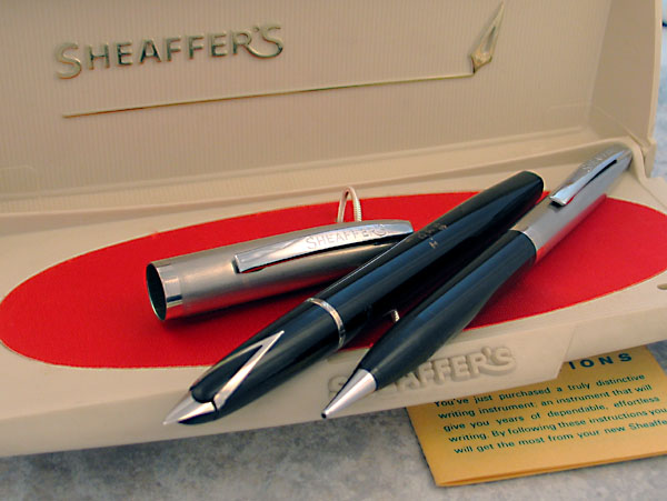
Sheaffer 500 Black Pen And Pencil Set In Beige Plastic Case c1962-1964
The 500 was the bottom rung of the "Dolphin" pens, but had a brushed stainless cap. This is something of a role reversal for trim and price as Sheaffer generally offered all-plastic pens at the entry level, followed by models with stainless caps, and then gold plated caps. Since there are only three pens in the line, this model probably found the bottom rung as Sheaffer made no all-plastic pen with a stainless nib. Available as cartridge or Touchdown filler.
Identification guide and features:
Sheaffer 800
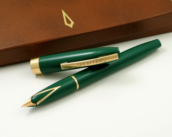
Sheaffer 800 Green Cartridge Pen c1962-1964
The 800 is the only all-plastic pen in the "Dolphin" line. The cap is essentially the same as the one used on the earlier Imperial I. The nib is unusual for Sheaffer in being solid gold and unhallmarked. Available as cartridge or Touchdown filler.
Identification guide and features:
Sheaffer 1000
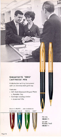
1963 Sheaffer Catalog Page Showing 1000 Model
Scan Courtesy Daniel Kirchheimer
The 1000 tops the line with a brushed gold plated cap. Like the 800, the nib is unusual for Sheaffer in being solid gold and unhallmarked. Interestingly, the 1000 was sold only as cartridge filler. It would be assumed that Touchdown versions found in the field would actually be an 800 barrel with a 1000 cap.
Identification guide and features:
Performance
Aside from two mint pen and pencil sets for photographs, I had a 500 and an 800 to test. As stated above, the immediate first impression for either of these pens is that they are regular Imperials until the cap comes off. The general fit an finish of these pens is about what you would expect from a 1960s Sheaffer Imperial. These are well made and well put together. They have a strong utilitarian look to them, probably due to the slim and straight forward design and simple colors. These were intended as well made everyday tools and it shows.
The test pens were fitted with unmarked stainless steel (or palladium silver) and gold nibs. They are slender and average size pens, with the same dimensions as an Imperial at about 5 1/4 inches long capped and open to a surprising 5 1/2 inches posted. Both are Touchdowns, but are quite light, the metal capped 500 being slightly heavier than the all plastic 800.
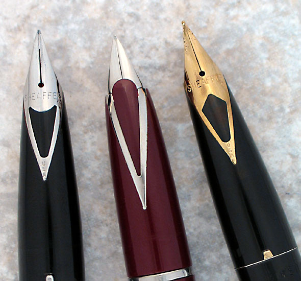
Sheaffer 500 "Dolphin" Nib Section (Center) Flanked By Two Imperial Inlaid Nibs
Caps slip on securely onto pips on the section trim band. This is a different and probably cheaper approach than on the more costly Imperial and Lifetime pens. The clip on the 800 is spring loaded and tight, making the pen easy to slip on a shirt pocket, even thick fabric. The 500 clip is a little stiffer, being crimped on, but works fine.
Touchdown fillers are fun to use. Unscrew the plunger, dip the bulbous Dolphin nose in the ink, one whooshing downstroke, ten seconds, wipe, and write.
The faux inlaid nibs grew on me with use. This is actually a pretty neat design. The nibs are very firm and write a smooth and even line.
I think these pens have a lot of appeal, especially the Touchdown version. It may be because of the pleasure of solving the great Dolphin Imperial mystery. As I became more familiar with these pens I began to enjoy them more. Now I'm looking around to see if I can find one in blue, green and gray. The good news is that they are generally not valued very highly, so a nice little collection can be put together with a low investment.
On to the next Sheaffer 1960s mystery, Watson!
Acknowledgement
Thanks to Daniel Kirchheimer for scans from the 1963 Sheaffer Catalog.
Comments on this article
may be sent to the author, Jim Mamoulides
PenHero.com Bibliography